Two Shelves


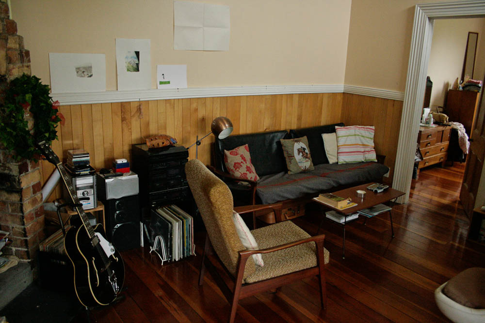
Working in a library, I am surrounded by shelves. Uniform, bland, easy to maneuver and reassemble. In that pale composite wood which feels like plastic (and probably is). Unmarkable, resilient against dust and made to withstand the daily grind of careless university students.
In the grand scheme of things, library shelves are nothing to write home about. 
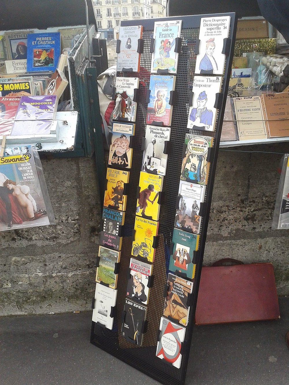
In libraries, shelves and collections are measure by metres.
"Well, the 300's are taking up 80 meters at present, but are growing rapidly," someone might say.
I have never actually bothered to find out if a standard library shelf is in fact, one metre long. The thought only struck me now, typing this, and I feel I am only one day away from a crucial discovery into the inner workings of the library world.

__________________________________________________________________________________

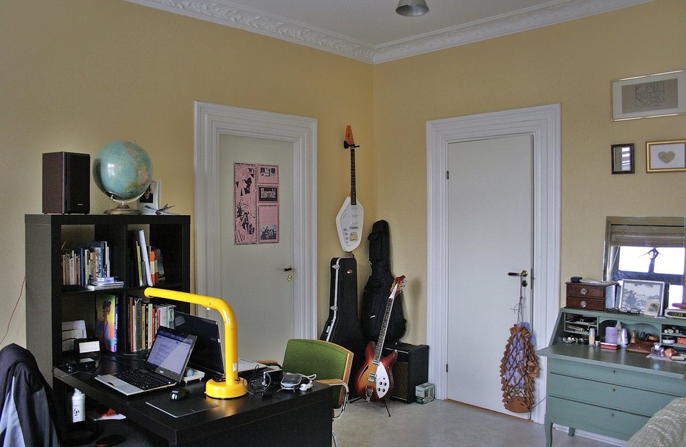
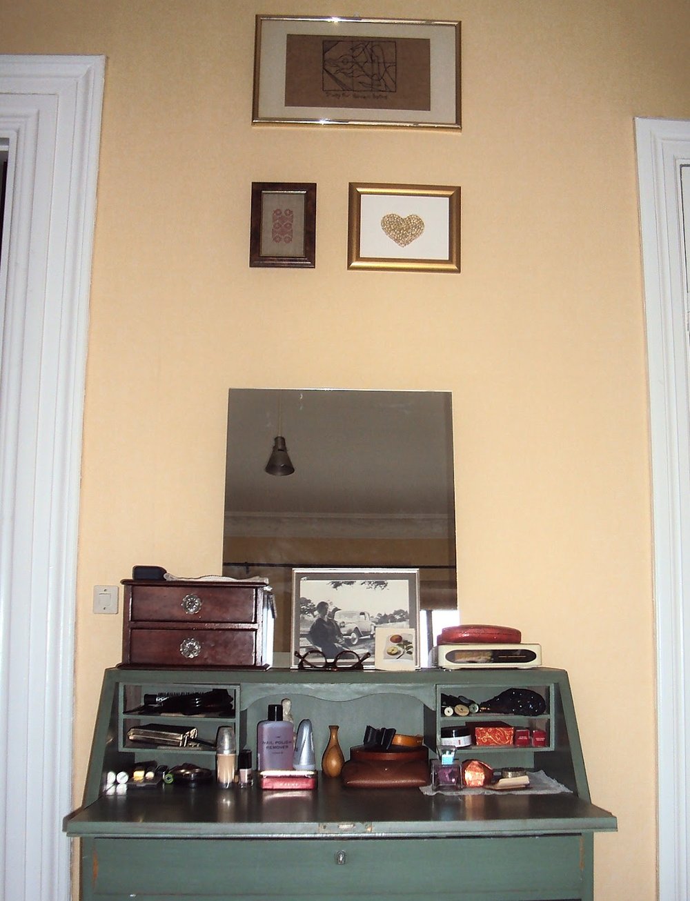
Shelves are like bridesmaids - there as a support, but not intended to distract from the object on display. I consider myself a sort of shelf personality: there to lend a helping hand, bolster my friends, a shoulder to lean on. I would love to be a bridesmaid one day.

As far as I know, there is no such furniture personality test. 

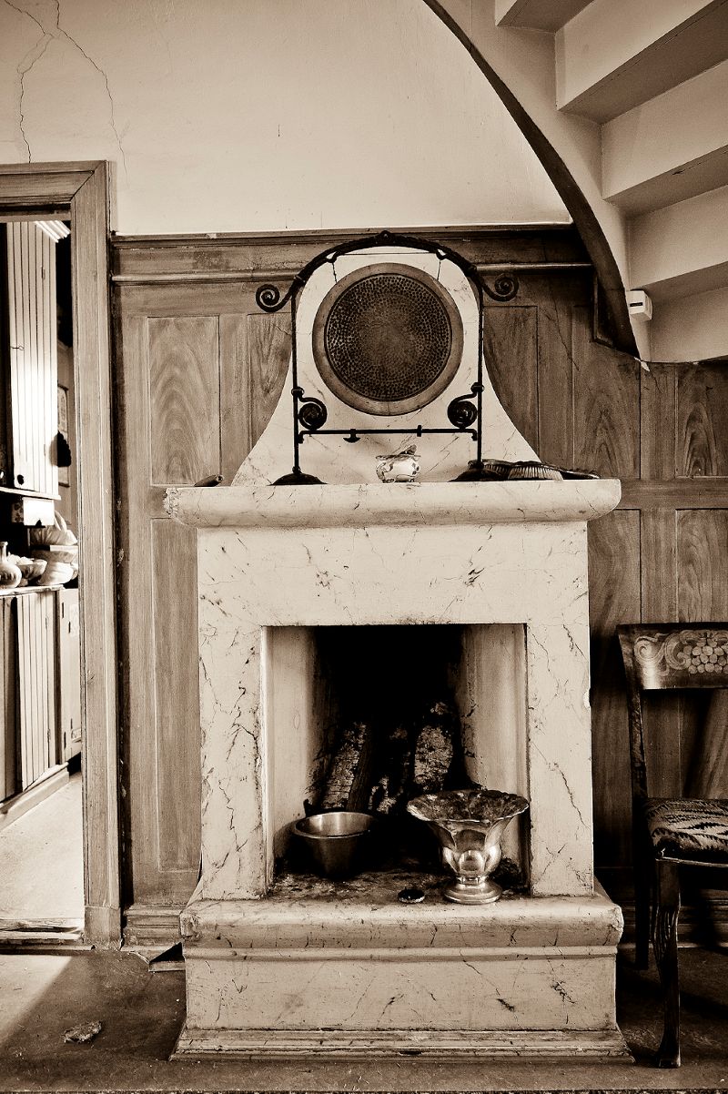
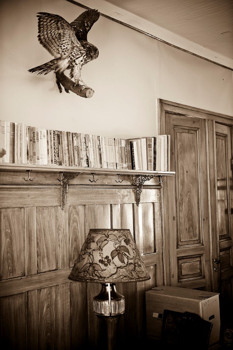
More often than not these shelf supports - brackets, frames and what not - are nondescript or non-existant. Great effort is made to make shelves appear as self supporting as possible, stand-alone objects, as if a plank of wood suddenly emerged from a wall,or is sitting balanced there by sheer force of will.

"Look Mum! No hands!"

___________________________________________________________________________________

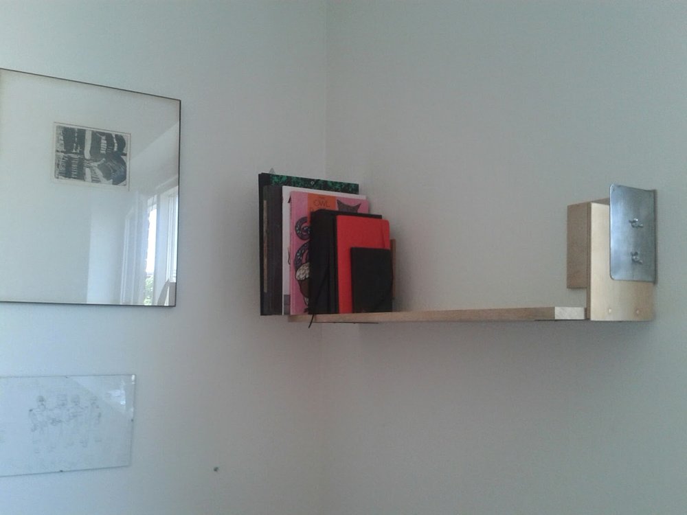
I have started building shelves as sculptural objects. Above are my first two efforts, utelizing discarded bookends sourced from the library. Objects not only functioning as weight-bearing horizontal surfaces adjacent to walls, but as explorations of differing ways by which to affix these boards to said walls. Supports supporting other supports - a network of brackets, braces, and wires tensing and compressing. Juxtaposing different materials, colours, forms in a balanced and harmonious manner.

A shelf should be just as pleasing to look at empty.


This is a spotlight that can be fixed to any appropriate surface, even the user's forehead.


Small things - clever, perfectly formed. Simple ideas, functional.
I want to simplify everything. I use so many words, smother works with a deluge of different ideas, theories, concepts each trying to justify the other while at the same time elbowing to the front of the queue.
I want to employ a new simplicity in my work - pare things backs, no over-involved plotlines; but to remember important phrases: a wild sheep chase; the macguffin; tangled threads of crime.

Just make statements. Of intent. I feel like I have been drifting aimlessly along for the past while (I don't even know when this feeling set in).
I found these lights in a book I was processing at the library. Great idea, suction cups! Beautiful and useful.
I am particularly partial to the light suction cupped to the forehead.

I want to put caster wheels on all my pieces of furniture so things can be easily moved around. I used to call these wheels 'coasters' because that is what they did, coast around.
Lights/Bookshelves/Cabinets not just tables and chairs. The ability to reassemble your living spaces. Living in movement.
Inspired by book trolleys at the library and a lamp suction cupped onto a dude's forehead.

Gaze and Glaze

Ceramic cups and teapots by Isobel Thom as part of the exhibition 'The Berlin Years' with Saskia Leek, shown at the Hamish McKay Gallery 18 October - 10 November.

Sometimes objects are so beautiful their presence overwhelms their functionality. I have always liked to think that I would be the person who would use such things in my everyday life - and thus get the most pleasure out of them, having been incorporated into the drudgery of my routine. Then again, I broke one of my prized glasses with a picture of a vintage car on it, and am still ruing my carefree attitude towards possessions I do actually care about.

The angular shapes of the tea sets and the stackable nature of the cups are so alluring - all those modernist sensibilities captured and executed on a small scale, while imbued with a sort of zen calmness and the practiced movements of the Japanese tea ceremony. The tea pots themselves have an almost Communist feel about them, their shape and twisting lid seemingly reflecting the hammer and sickle.

I am drawn more and more towards art and designs more closely aligned with craft arts - textile crafts such as embroidery and knitting, ceramics, whittling, jewellery, the making of objects. I am at a sort of cross roads in my life at the moment, and I am not sure what I am wanting to do. All I know is that I do not want my career to be 8 hours a day sitting stationary in front of a computer, and I want to do something with my hands. I believe this is why my artworks are delicate, time consuming and hand made. It is a way of combating the pull of the internet - a direct backlash to the power of technology. Crafts seem to defy the claims that everything can be done on a computer.

Mates


Chess sets designed by Man Ray and Marcel Duchamp.

Man Ray chess pieces 1926 / Man Ray chess set 1947 / Marcel Duchamp chess pieces 1918-1919 / Marcel Duchamp pocket chess set 1943


The two friends in the midst of a game.

patterns within everyday life


Patterns are present in every facet of our daily life, tangible ones and abstract. Patterns can be chaotic or reassuring - a hectic psychedelic kaftan or the simple routine of repeated motions.  I have always held an interest in patterns - how can one not when the are the very building blocks of our lives so to speak. Patterns are like clues - to a life/style, in a detective story. One is always looking out for patterns in a hope of building up the larger picture.

I have long thought about creating patterns myself, patterns that can be multiplied and replicated and printed on material, a thought that has wandered in and out of my consciousness intermittently throughout my teenage and adult years, and something I have tried to integrate into my art practice both conceptually and in more literal forms.
Above is a sculpture I made as part of my graduating installation at Elam. Apart from the sculpture papier machéd in fake marbled Formica, on the floor lies a piece of paper - a pattern I made stamping a letter W across the page, first right way up, then the wrong, creating a sort of diamond/chicken wire pattern, though one that was shaky, riddled with errors, obviously executed by hand. The result (virtually indistinguishable in the poor photo above) was a little similar to Latvian artist Viktor Timofeev's 'WWW', which I stumbled upon by chance on the website PATTERNITY.

It was from seeing the designs of Sonia Delaunay as part of an exhibition at Louisiana about Avant-gard in the early Twentieth Century. The designs we simple and intriguing, her involvement with the Orphism movement clearly influencing her use of colour and circular motifs, as well as using rectangles, forming patterns like parquet floors. And while seeing these patterns manifest themselves as clothing and fabric was beautiful, I was drawn to her original drawing and sketches, watercolour and gauche on paper, the illustration of the first hint of the idea. It all seemed so casually executed, yet with great finesse.

"I have done fifty designs, relationships of colour using pure geometrical forms with rhythm. They were, and remain, colour scales - really a purified version of our concept of painting. (...) The rhythm is based on numbers, for colour can be measured by the number of vibrations. This is a completely new concept, one which opens infinite horizons for painting and may be used by everyone who can feel and understand it."
- Sonia Delaunay

In a time where I feel I am surrounded by art that is grandiose and powerful, large-scaled, minimalist and monochromatic and technical, it is a wonderful feeling when such small, old, basic illustrations of ideas can capture so much of my imagination. And with the hectic pace of the fashion world, and the types of prints fabric and textile designers are creating: digital, luridly coloured, computer generated, to look back on the prints of Delaunay is not such a bad idea.

And maybe this will be something I will continue with, interesting fabric patterns for and from everyday life. My first one (apart from the W netting) is a pattern of boots and noses.

Interiors (Sweden)


A few views of our new room, main feature our new multi-purpose Ikea book shelf/desk unit. Kris's old lamp, a classic 1970's design by Anders Pehrson for Ateljé Lyktan called 'Tube' has pride of place.

The room has two large windows with both bamboo rolling blinds and a lucky find of some perfect sized second hand curtains in a rather thick luxurious fabric. (I don't want to be awakened at 3am every morning during summer with glaring sunlight, when sunrise is early and streams through our eastward facing windows. However, during winter it has been a pleasant wake up call, when the sun doesn't rise often before 8am.)

In one corner Kris displays his his collection of guitars, he took an acoustic one from his parent's house upon which to teach, but no evidence of this has yet eventuated. Diagonally opposite is a bookshelf housing his vinyl collection, with maybe a dozen of my own slotted in at the end. Moving countries requires much downsizing and I have not started to rebuild what records I had except for somehow finding 4 Fleetwood Mac records, and miraculously, the self-titled debut of The Paul Butterfield Blues Band, which at the moment rests in front of all the others so I can glance over at it and not believe my luck.

Above the secretary which I adopted from the kitchen hang an embroidery Granny made for me, and one I made for her. It is nice to have a piece of furniture where I can put my knick-knacks and jewellery and such, and then fold the top up to keep secure all the daily detritus I deem important in spilling over.

It is strange looking critically at the room sometimes and realising how few possession I have accumulated, even after two years of living here. Yet I don't feel like I am lacking much (saying that, I would like to funnel some of the funds I currently spend of clothing into other endeavours: books, records, paintings and drawings, nice plates, jewellery.) When I think of my room in New Zealand, I can remember having so much stuff, but hardly any particular objects spring to mind.

Interiors (New Zealand)


Seeing where people live, how they display their possessions and what to them makes a livable and harmonious environment are a never-ceasing area of interest. I think my extended family have always had impeccable interiors, successfully reflecting their personalities and aesthetics.

Granny's flat, complete with many amazing artworks installed Salon-style. There was nearly no free wall space, every available square inch utilized for displaying her collection.  Staying here for one week while in NZ made me fully appreciate framing works/pictures, and I have been scouring second-hand shops in Malmö hunting down suitable frames with which to house my few prints and drawings, mainly done by myself.

Harriet and Chris' living room at their flat in Onehunga. A great mix of leather, lacquer and vinyl. Wooden floors, wooden walls, open brick fireplace. The best thing about houses in NZ is the abundance of wood, something sorely missing in our Swedish apartment. Swedish apartments have lots of things going for them - double glazed windows, central heating, ornately plastered ceilings - but linoleum floors and concrete walls are not the best sometimes.

Both these interiors made an impression on me, knowing as I did, that after my holiday in NZ we would be moving rooms to the largest on the in flat, complete with walk-in wardrobe and an opportunity to arrange and rearrange my still rather meagre but slowly growing collection of possessions presented itself.

Focus de luxe


Swedish designer Folke Arström's stainless steel cutlery "Focus de luxe".

I scanned this image at work from a book about Swedish Industrial Design which was to be inter-loaned.
I was flicking through it hoping to find an image of the cutlery set my Granny had.

And all of a sudden, there they were.

Originally introduced at the H55 architecture and design exhibition in Helsingborg, the cutlery has been back in production since 2006, and would be a wonderful merging of beautiful design, Sweden, and happy memories of dining in style with my grandmother, should I purchase a set.

Facade


Designer Tokujin Yashioka created this window display for Maison Hermès for the winter of 2009. A black and white video of a closely cropped woman's face as she gently exhales - while a hanging Hermès scarf billows in sync with the imaginary air, due to a stealthily concealed fan.
A wonderful illsion of life and movement which shifts the focus from the fabricated nature commonly associated with the silver screen, into a new semblance of reality;  perhaps a literal, physical manifestation of the idea of 'breathing new life' into something.


in fact, according to the man himself:
"on designing a window-display of Maison Hermès, I intended to express people’s daily 'movements'
with a suspicion of humor. there are moments when I perceive a hidden presence of a person in
the movements born naturally in daily life. I created a design where one can perceive someone
behind the scarves as if life were being breathed into them.
the window is designed with an image of woman projected on to a monitor. the scarf softly sways
in the air in response to the woman’s blow."


I am always impressed by how as colloquialism, pun or play on words can, instead of just being a one-trick pony, manifest itself into a multi-faceted, layered work. This idea is something I aspire to achieve with my own work and my own incorporation of wordplay therein.

quote via


Taking the secret passageway to the Conservatory


Pictures of a house up for sale in Jönköping. Feels rather reminiscent of the Bate's family home in Psycho, with the taxidermied birds, wooden paneling on the upper landing and a mysterious hidden door.

Edward Hopper's The House by The Railroad (1925) was inspiration for the appearance of the Bates' Mansion. The original set consisting of the house and the Bates Motel, still exists on the Universal Studio's back lot.

Sea Legs


The RMS Queen Elizabeth on fire and as a shipwreck in Hong Kong Harbour, 1972.  While being converted into a University cruise ship (a rather amazing idea), the world's largest passenger ship mysteriously caught fire as her refurbishments neared completion.  So much water was poured into her, in a vain attempt to combat the blaze the ship eventually capsized from the weight, and lay wrecked in Hong Kong Harbour for many months, until eventually being partially scrapped to be used as landfill for Hong Kong Airport. Parts such as the keel and boilers still lie on on the seabed, and are still marked on local maps as 'Foul', an unsafe area to anchor a boat.


The wreck of the RMS Queen Elizabeh made for one of the more interesting film locations and sets when used as a covert MI6 headquarters in the 1974 Bond film 'The Man with the Golden Gun'. To accommodate for the capsized liner's continuous lean, the Secret Service apparently constructed new floors, ramps, staircases and bookshelves, making for excellent clashing wallpaper patterns, bizarrely distorted corridors,and staircases upon staircases.


Cinema Replica


 Hand painted Russian movie posters
KILL BILL / MEN IN BLACK 2 / MATRIX 3 / 50 FIRST DATES / TROY

foreign films that were brought to Russia's rural areas and shown makeshift cinemas were promoted with these captivating naive posters, made to measure and on demand by hired 'professional artists'. many were employed in house to keep up with the steady stream of incoming films, seemingly mostly sequels.


via designboom

A Hazy Shade of Winter


[click images to enlarge]

ASH KILMARTIN
'RAIN'
 12.02.2011


A special parcel received in the post today travelled halfway across the world wrapped in paper adorned with colourful donuts. Inside was the eagerly anticipated publication made on the occasion of my great friend Ash Kilmartin's single-handed one day sculptural exhibit 'RAIN', situated in an abandoned lot in Melbourne.

Ash asked if I would contribute a piece of writing to accompany her exhibition as part of a small one-off publication, and I readily obliged. I penned a short piece about my first impressions of snow, (which is hopefully legible in the photo above) and thought about my feelings towards snow in relation to Ash's installation, delicate hand stitched fabrics draped over minimalist wooden frames.

The publication design is by another good friend, Claire Cooper. I am particularly partial to the horizontally bisected green hued centre-fold, opening out to reveal the text and various youtube stills.

A great project to be apart of and one which has already given me ideas of like-minded scenarios.

Dens of Inequity


images via

Spreads from Benjamin Critton's project, EVIL PEOPLE in MODERNIST HOMES in POPULAR FILMS. A publication printed in a pleasing red/yellow colour combinations, and includes quotes, diagrams, film stills, essays and more, delving into the relationship between architecture and cinema, and the association between ill-morals, vices and evil masterminds with modernist homes, traced through films along the lines of Diamonds Are Forever, The Big Lebowski, Blade Runner, L.A Confidential and Twilight amongst others.

Ideas like these interest me - I think about my embroidery floor plans of fictional settings from film, television and literiture connected by also their dual locations - existing in some manner in the 'real world' while only wholly residing in the imagination. The cliches 'picking up the common thread', and 'that nothing is ever a coincidence' are phrases oft repeat in the many murder mystery stories and screen adaptations I digest and that act as a sort of back bone to my practice.

I recently posted some photos of rock stars in their parents' houses and I was struck by how Frank Zappa and David Crosby were attired to seem in sync with their surroundings, while their 'modern dress', long tresses and full facial hair were at odds with the more conventional clothes of their parents. The photo essay was intended to highlight the different lifestyles and ideas between the different generations I believe, and this sort of contradictory outcome of matching someone to a surrounding meant to represent 'old' is intriguing.

I think about characters and their personalities reflected in their environs, and I can understand the cold, shiny surfaces, the hard right angles and the looming rooftop overhangs that cast ominous shadows mirroring the mentalities of the people who live in them. The character must embody their abodes and vice-versa. The brutalist nature of the buildings is apparent in the architecture, scale and materials. Grand concrete cubes with misleading panels of glass maybe not so that one can see in the house, but that whoever is inside can see them coming.


The 'evil people' of these popular films could perhaps be described as cold, clinical, calculating, corrupt, conniving, controlling and cruel, while also being charming, charismatic, clever and compelling. (I have run out of apt adjectives beginning with 'C' now), and possibly the same could be said about their dwellings.

I suppose this is why Ernst Blofeld only wears grey.


on a side-note, check out Critton's CV. As someone who is trying to wrangle a job out of Sweden (who is not being particularly forthcoming about it) I have taken a particular interest in other people's curriculum vitaes at present.