Surface details.


Kilmartin House Museum, 2013, Bronze Thirteen pieces, overall size 3 m diameter / The Perpetual Plannist, 2012, Artist’s pages for Un Magazine 6.2, December 2012 / Floor Work, 2012, Acrylic, Dimensions of the floor, less 30cm at each edge

All works by Ash Kilmartin.

I love these three details of works by my clearly talented good friend Ash Kilmartin, which I have blatantly thieved from her website with only the best intentions.  The separate works were made over a  period of two years, but the repeated use of specific colours, shapes and scale create a sense of a continuation or investigation of a larger theme or project; ongoing research which manifests itself in different but familiar ways as her practice evolves.
The considered interferences on floorboards, the oval shape of the front pad of a shoe sole is mirrored in the stripped back paint surfaces which surround the embedded key. All surrounded by a particular shade of orangey pink, which sooner or later could be known as 'Ash Kilmartin Salmon' (which doesn't really sound like a colour at all but hey) in a similar vein to Yves Klein Blue.

Possible colour names for that particular shade welcome.

first sighting


Florence Wild, The Love I Saw In You Was Just A Mirage (detail), 2011-2012, white embroidery thread on white shower curtain.

I made a large embroidery in white on white. It was installed in a rather dimly lit corridor with a very strong, very bright spotlight upon it, giving it a startling presence. However in turn it was, almost undocumentable.
I am working hard at procuring some images which adequately reflect the whiteness/shimmering/textural differences/handwork or at least where the entire image is visible. At the moment all that is captured is the surface area, some vague outlines, and blinding lights. Like a mirage on the horizon perhaps. Quite apt, that.

sustenance


Loving these installation shots of Xin Cheng's exhibition project 'Sustenance' at Split/fountain in Auckland. I am heading back there next week - (this time next week I will be in a plane, hopefully fast asleep) and am looking forward to seeing what has been happening in the Auckland art scene in my absence (if everyone is not on holiday at the time, but really who can blame them).
Will be bring some works with me, so if there exists anyone who actually bothers to read this and knows of any suitable spaces to exhibit some works on paper, inform me! (or inform the space of my awesomeness, if you hold that belief).
Be seeing you, Auckland!

In my own backyard

images via we find wildness, but really via neeve

It is odd when you discover things happening a stone's throw from your house on the internet. I was stopped in my tracks on a daily scroll through my reader, by the captivating image by Georgian artist Thea Djordjadze. The images are brief glimpses of her exhibition 'Our Full', showing right now at Malmö Konsthall. Right in my back yard.

Tomorrow I will take an hour out of last minute christmas shopping and the like to chill out in what seems a really fascinating show. The more shows like this I see the more excited I get about my own art practice, and my efforts to uphold it against rather minding numbing library drudgery.

an idea and something to accompany it


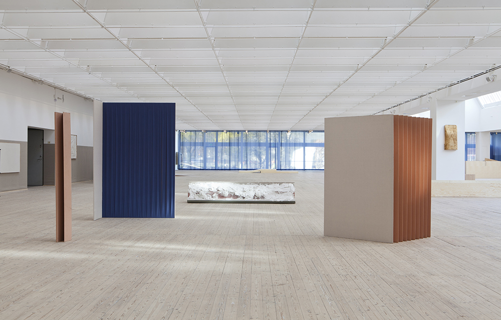
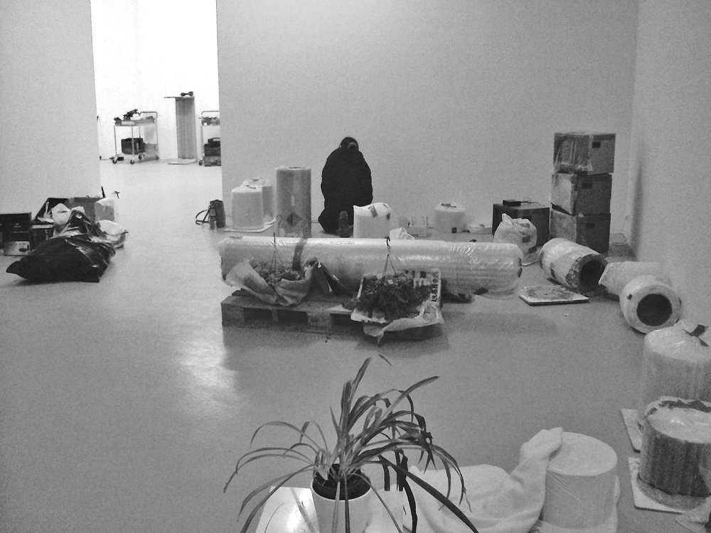
Leonor Antunes at Marc Foxx via Contemporary Art Daily.

"assembled, moved, re-arranged and scrapped continuously"

(excerpt from press release:)
In this exhibition, Antunes considers Brazilian modernist architect 
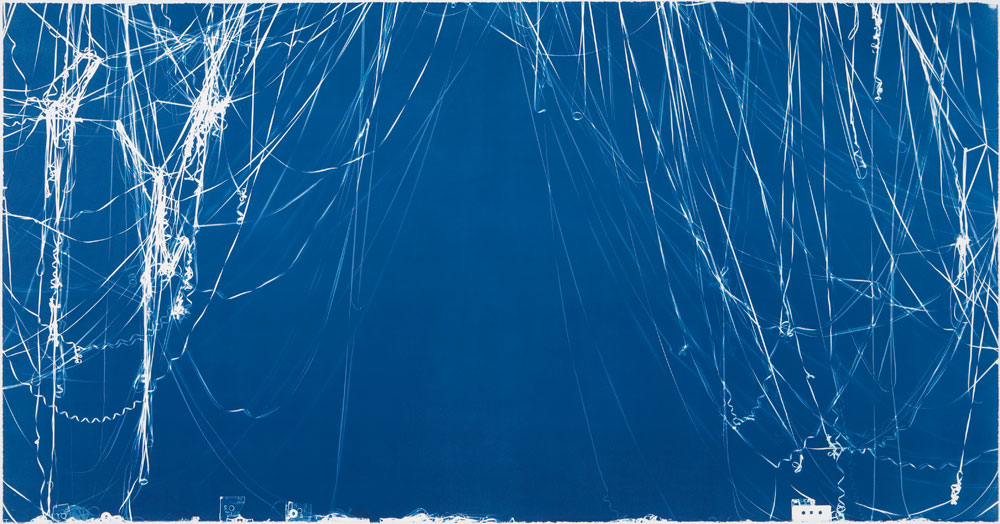
Lina Bo Bardi in “lina” 2012, a delicate brass and silver constructed curtain which is a reflection of the parquet floor design in the immanent modernist house she designed, known as the “Glass House” built Sao Paolo in 1951. Bo Bardiʼs influence can also be seen in the soft red leather floor work, “discrepancies with L.B.” which takes its form from the hard gridded window treatment of Bo Bardiʼs building “Sesc Pompeii”, also in Sao Paulo.

“lina” is installed upon “assembled, moved, re-arranged and scrapped continuously”, 2012, the exhibitionsʼ title and largest sculpture. The 
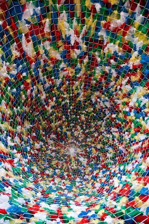
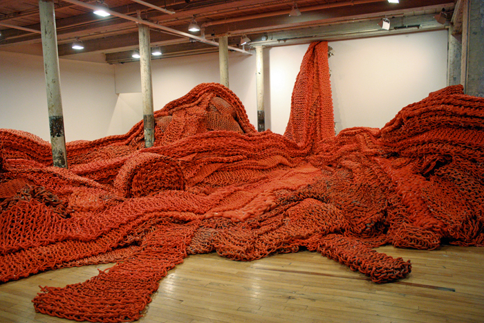
9.5 x 9.5 foot walnut wooden pavilion is also the venue for “chão”, 2011, a 12 part hand- knotted and incrementally increasing, gridded series of delicate black nets. The canopy itself delineates the room, asserting an almost domestic feeling and providing an exhibited arrangement of grid upon grid within the show.

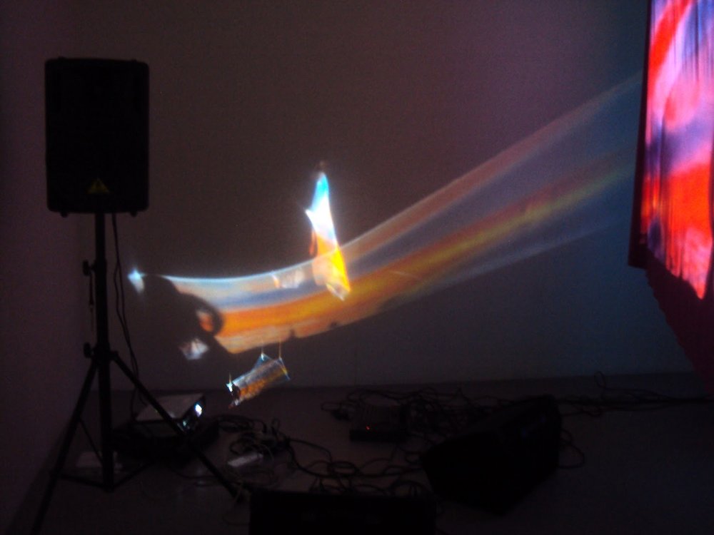
Hanging from the rafters and breaking her gridded constructions is the organic work “random intersections #7”, a sculpture made from handmade black leather straps, similar to horse bridals and referencing Carlo Mollinoʼs equestrian school in Turin “Società Ippica Torinese”, built in 1937 but destroyed in 1960. Antunes, like Mollino, has a great appreciation for the movement of material and this work brings her materiality back to a more corporeal connection.

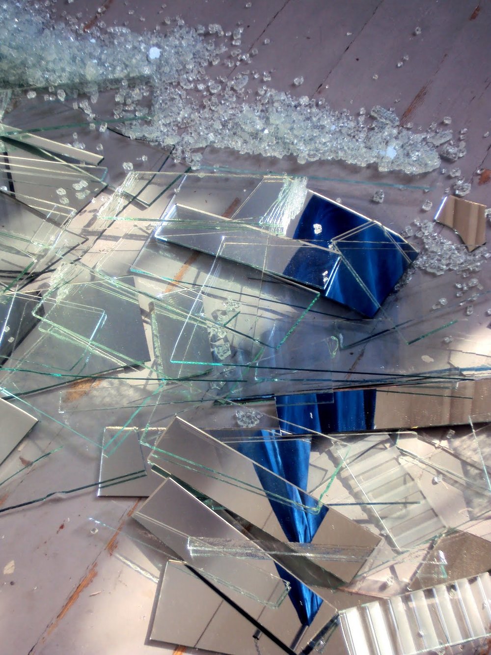
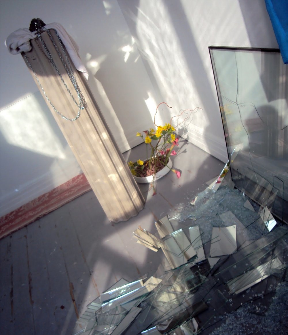
The marriage of the fine black netting, the metallic glimmering curtain and the robust and darkly slick wooden structure upon which the works adorn, makes for an interesting and pleasing relationship. It reflects various thoughts I have myself had recently, revolving around an abandoned metal spring-bed base (which has since disappeared, and whose disappearance I may not fully get over for weeks or months) and a large pile of flaccid overstretched rubber bands.

I think it is only recently that tactility has taken on such importance in my work. The overwhelming feeling of wanting to touch something is luring me into the photographs of Antunes' work.

Knotting, linking, twisting; connecting ideas and materials is a common motif represented in my practice, building up textures and surfaces, images from small marks or gestures - stitches, knitting, creating patterns, repetition of shapes, reshaping the line - whether it is a length of embroidery thread or a pencil mark on paper.

(some notes from my journal)
"an interesting object (the bed base), black and silver and brown, stripped bare of any embellishments. skeletal. the bare bones. structural, architectural. the inner workings, masculine. Uncovered, exposed.
a single bed, only room for one.
standing upright, no room for anyone.
removed from it's original function/identity.

the coils and springs have a hypnotic quality, round & round.
rubber bands - the opposite of the coiled spring: soft, flaccid, stretchy.
mirroring the circular motif of the springs but out of shape, wobbly, chaotic, disorganised.

spring : springa sprang har sprungit (run, ran, have run)
spring is run in swedish.

a netting of rubber bands, covering the upright bed base. draped over the frame like a caress, an arm across the shoulders. a shroud/net encompassing it.
the bands are like thoughts, ideas, anxieties, unanswerable questions, dreams.
what fills the mind and what weighs one down.
tangled threads - made even worse with no beginning or end, circles connected to more circles, no straight lines here.
rubber bands with the ability to be stretched and reached through but can they ever be escaped from?"


just some thoughts to be thought about.
first item of business, sourcing another perfect spring single bed base, and ruing the missed opportunity of the one I thought was languishing casually waiting for me to get home from work to be rescued.


Attention to detail

two works by Daan Van Golden at Wiels Contemporary Art Centre, Brussels, and two views of Martin Creed's installation at sketch, London.

Daan van Golden
His relatively small but diverse body of work is characterized by an acute attention to detail. References to important works from art history, as well as to less exalted images from commerce, pop-music and daily life are important components of his work. Van Golden has never been too concerned about prevailing artistic trends and has always carved a path of his own. His art does not consist of large brushstrokes, but of a much more modest gesture: his paintings are the result of a labour-intensive process, whereby a visual motive is explored in a very careful and precise manner.


Martin Creed at sketch:
Work No. 1347 consists of 96 different types of marble, in a formation of zigzagging lines across the floor, while Work No. 1343 is a new work specially made for the restaurant in which every single piece of cutlery, glassware, lamp, chair and table is different.

Attention to detail is an important thing. Something I seriously consider and take pride in with my work. While I appreciate the grand gesture, the found object, and the impersonal minimalism, there is something about labour intensive finely detailed craft which resonates with  me. Details are what give things credibility and authenticity apparently - at least this is what people praise and/or complain of in any televised period drama. The measure of something.

I like to think of details slowly building themselves up, accumulating numbers until their presence is inescapable. I strive to create a sort of push/pull effect - where the audience must step back from the work to take in the full picture, but afterwards are pulled close to see how the image is made.

It is in the details that one finds the clues in a murder mystery ("The Murder Mystery" could pretty much be a concept by which I question the meaning of life through my art practice). Red herrings too. It could just be the way a person phrases a sentence that gives the game away. I like to try and watch out for it, pick up the clues en route, and form an educated guess as to whom the perpetrator could be. It rarely, if ever happens like that however.

At this point it feels apt to admit that every single school report card given to me used the word 'diligent' in some capacity. It is a word that follows me around, and during my final year of art school, finally infiltrated my studio.

Before I used to sit on an idea, shape it like a bit of clay in my head, bolstering it with various concepts, cultural references and the like. My idea process changed while my work changed, and it took on a more insular, patient, labour-orientated facet, and all this time spent working, was also spent thinking, and both started to influence and build upon each other, and also from the music playing while this working and thinking process is going on. Hmm, sounds pretty wishy-washy. Bit new-age, 'organic'.

I guess what I am trying to with my writing these days is a similar method to working and thinking simultaneously. Trying to reach some level of clarity just by typing sentences around some of the thoughts in my head. Different ways of saying the same thing.  These days I just start writing things down/typing things out, seeing where they will lead me and how often I repeat myself.

And by-the-by, I am convinced that Van Golden's work of the young girl cartwheeling is out of sequence. Surely the 3rd and the 4th images should be switched around to give a complete cartwheel? But maybe, that is the whole point of it - that the details don't add up.

EFFEMINACY - Kah Bee Chow


A few slightly blurred images from the opening of Kah Bee's masters show, Effeminacy. I was wandering through the show when a friend of mine came up to me, and as a way of saying hello queried "where's the cat?". Thinking she meant the video of internet sensation Maru, I told her about it. Only to be corrected "No, Kah Bee said there was going to be a real, live cat wandering through the show". I said I had seen no evidence of such an event, but considering Kah Bee, I wouldn't put it past her. When I found the artist, wearing a friend's baseball cap at a jaunty angle and with a long stemmed red rose between her teeth, I asked her to set the record straight on these cat rumours. KBC admitted at some point during the installation's run, a cat would feature. I really hope this was not just the opening night enthusiasm and alcohol intake talking.
With various cylindrical forms and structures covered in carpet it really is a cat-scratching haven. Or a Grecian-meets-Babylonian themed cat café, at the very least.

I noticed your walk changed as you went through the show. The layout, the scattering of objects across floors, strategically placed to dictate movement, forced the viewer to alter their gait to a delicate prowl. Almost like dance steps. One, step, two steps, pivot, crouch down to examine a video or an ikebana oasis, and up again. Repeat. You could almost feel rather cat-like yourself.

In her own words:

"When I was four years old, I came across a pack of crayons on the new lounge suite in the living room. I started testing out what the crayons could do and I learned I could leave markings on the textured upholstery of the sofa; a revelatory assignment. So I got to work that afternoon, I worked hard, attacking the surface with manic and more manic scribblings. I worked to colonize this expansive territory, smearing waxy residue over the entire set of furniture. I would use up one crayon, move onto another and another. It was exhilarating work. I had found my calling.

When my father returned home from work, I don’t recall what happened immediately after – but suffice to say, I didn’t anticipate the response that would come. At some point, I was placed outside the House. I clutched onto the grill of the gate outside our home, wailing like the banished offspring of an all-powerful God.
When I was finally allowed back into our house, I remember my father’s back turned towards me. He didn’t have a shirt on, he was on his knees, sweating profusely, scrubbing the sofa with his life."

and

"I channel the savages when I eat watermelons. Oranges also. They taste better when your teeth tear the flesh off the rind; puncturing the sacs so the juices run and collect into a pool inside your mouth. It doesn’t work with a mediocre orange. I once read: “We love beauty within the limits of political judgment, and we philosophize without the barbarian vice of effeminacy."


Barbarian vice of effeminacy: imagine this paradoxical compatibility.


Effeminacy pours from an excess of refinement not reined in by a soundness of thinking; it rings of aristocratic overkill, a persistent, eternal infantilism afforded by privilege. How does the barbarian; the cannibal fall for the effeminate? Where do they even meet? I could not draw a line around a territory, not because one belongs on the outside and the other within, but because they operate as a kind of corrupting impulse; their shared lack of restraint comes to surface but eludes arrest. They don’t meet up for coffee and they don’t scope out each other’s Facebook profiles; they are criminals on the run, they go chasing waterfalls."


Foliage Flourish


It is not uncommon these days to come across an installation of a young artist complete with the cursory gesture of the placement of an overly-considered potted plant - usually derided in my eyes as some sort of counter-balance to the generic minimalist neutral hued rectangular forms which staidly take up space.

These images though hark back to the days where the foliage was not necessarily part of the art but part of the atmosphere. Carefully cultivated plants used to litter the Walker Arts Center, sometimes appearing so out of place it makes you wonder if they were not 'planted' there by rogue Intervention Artists.

It does have an interesting effect however - some of the photos grouped together from the Walker Archives could be mistaken for foyers and waiting rooms of upper crust lawyers. It is also rather fascinating how the presence of the plants seem to fulfill the absence of an audience in most of the images - they take on a sort of personality, having heavy handed critiques in corners, or sidling up to a painting for a closer inspection of the brushstrokes.

Just like ash trays in libraries and Benson & Hedges sponsoring cricket, I can't see pot plants in galleries making a comeback in the near future. However, I will be moving into a new room this weekend, giving me the space and the opportunity to install a few artworks by friends I picked up last year, alongside a well placed potted plant to keep them company.

more images and a little background info about 'Plant as Decorative Element in a Gallery' on Off Center.

Facade


Designer Tokujin Yashioka created this window display for Maison Hermès for the winter of 2009. A black and white video of a closely cropped woman's face as she gently exhales - while a hanging Hermès scarf billows in sync with the imaginary air, due to a stealthily concealed fan.
A wonderful illsion of life and movement which shifts the focus from the fabricated nature commonly associated with the silver screen, into a new semblance of reality;  perhaps a literal, physical manifestation of the idea of 'breathing new life' into something.


in fact, according to the man himself:
"on designing a window-display of Maison Hermès, I intended to express people’s daily 'movements'
with a suspicion of humor. there are moments when I perceive a hidden presence of a person in
the movements born naturally in daily life. I created a design where one can perceive someone
behind the scarves as if life were being breathed into them.
the window is designed with an image of woman projected on to a monitor. the scarf softly sways
in the air in response to the woman’s blow."


I am always impressed by how as colloquialism, pun or play on words can, instead of just being a one-trick pony, manifest itself into a multi-faceted, layered work. This idea is something I aspire to achieve with my own work and my own incorporation of wordplay therein.

quote via


Off Vantage Point


Felice Varini
Zigzag entre le cercle at la tour (Niigata, Japan), 2009
Castillon du Gard n.1, 1981
2006 Huit carres (Versailles, France), 2006


Felice Varini was one of the first artist models I chose for myself, (back in the days where artist models were the way ideas came about) in my sixth form sculpture class. I was drawn to his disregard for reality, treating the three dimensional landscape as a blank canvas, and the masterful illusions he created. The tangible illustration of this fictional plane place on top of the world as I knew it impressed me. I was always more interested in the ways the work changed once one abandons the 'vantage point'. The spot where Varini pulls the strings, and seemingly halts movement, slows time and flattens space. (for some reason, probably due to photographs, I always imagine viewing the works as being a solitary endeavour - only one person can be at the precise vantage point at one time, and the view is never hindered by the presence of living things.) And instantly, one is shown The 'ANSWER'. There, laid out bare and perfectly formed, waiting to be accepted, when you are in 'the right place at the right time'. In that respect, apart from their unfailing apparant solidity, the works are similar to mirages.

The works 'off vantage point' seem so much more dynamic, full of diagonal lines of motion and distortion. Perhaps this reflects my natural view of the world as a whole, a place full of clues, hints, red herrings and false trails, smaller pieces of information amassing to create something larger than the individual scraps themselves, continuously linked together. One cannot be directed to a static spot, providing the end and not the means, offering only the solution.

I like to reside within the fiction and the reality, so then it becomes up to me, and my existing within the space his works occupy, as to whether I join the illusion. Instead of standing still, I would walk around the works in a semi-circle, crossing the 'vantage point' somewhere in the middle.

I think of one of my favourite quotes when looking at Varini's work, from Dennis Potter's 1987 masterpiece The Singing Detective:

"All solutions and no clues, that's what the dumb heads want. That's what the bloody novel 'he said, she said, descriptions of the sky..., I'd rather it was the other way round, all clues no solutions, that's the way things really are. Plenty of clues, no solutions."

Ljus utan skuggor


Kah Bee Chow
Ljus utan skuggor
2011

concrete, glass, cyanotype on silk, broken glass and mirror, globe pendant lamp, sanded floors, blanket, digital print, towel, sawn homeware catalogue, cup, steel chain, steel tube, found rocks.


A glittering array of carefully contructed mountains of polished glass, gently draped printed fabric, stoically robust grey columns and the reflections of plants/chains/crystals/aforementioned items caught in broken shards of mirror, while bright sunlight bears down and casts shadows that perhaps weren't meant to be there.

Kah Bee Chow's installation for the Malmö Konsthögskolan's annual exhibition open days was indeed a highlight. I love the feeling of seeing your friends make great work, which in turn inspires your own efforts.

A Hazy Shade of Winter


[click images to enlarge]

ASH KILMARTIN
'RAIN'
 12.02.2011


A special parcel received in the post today travelled halfway across the world wrapped in paper adorned with colourful donuts. Inside was the eagerly anticipated publication made on the occasion of my great friend Ash Kilmartin's single-handed one day sculptural exhibit 'RAIN', situated in an abandoned lot in Melbourne.

Ash asked if I would contribute a piece of writing to accompany her exhibition as part of a small one-off publication, and I readily obliged. I penned a short piece about my first impressions of snow, (which is hopefully legible in the photo above) and thought about my feelings towards snow in relation to Ash's installation, delicate hand stitched fabrics draped over minimalist wooden frames.

The publication design is by another good friend, Claire Cooper. I am particularly partial to the horizontally bisected green hued centre-fold, opening out to reveal the text and various youtube stills.

A great project to be apart of and one which has already given me ideas of like-minded scenarios.